sanida

Sanida makes digital marketing simple and accessible to every business owner.

sanida

Sanida makes digital marketing simple and accessible to every business owner.

UX

UI

complexed system

Web design

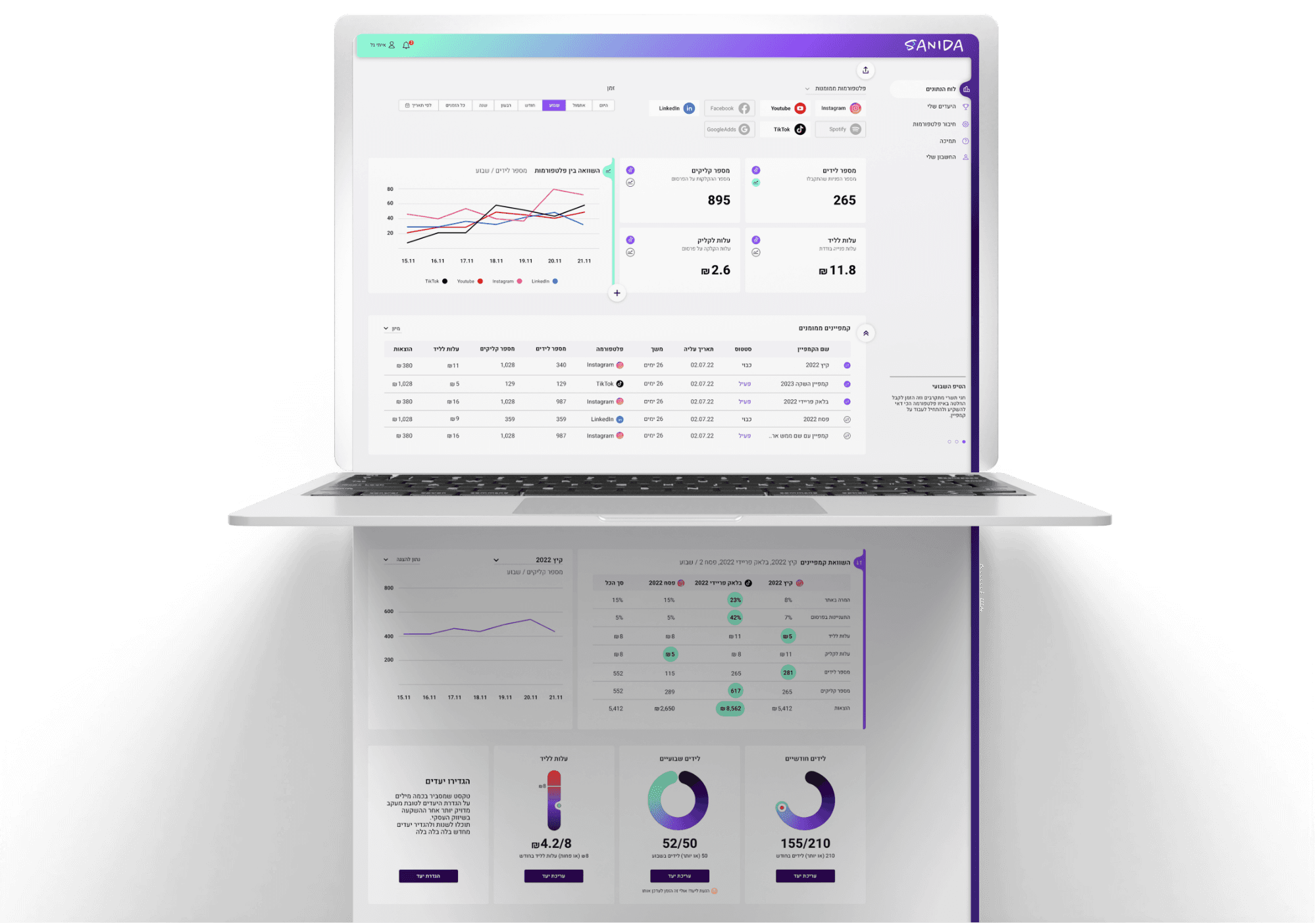
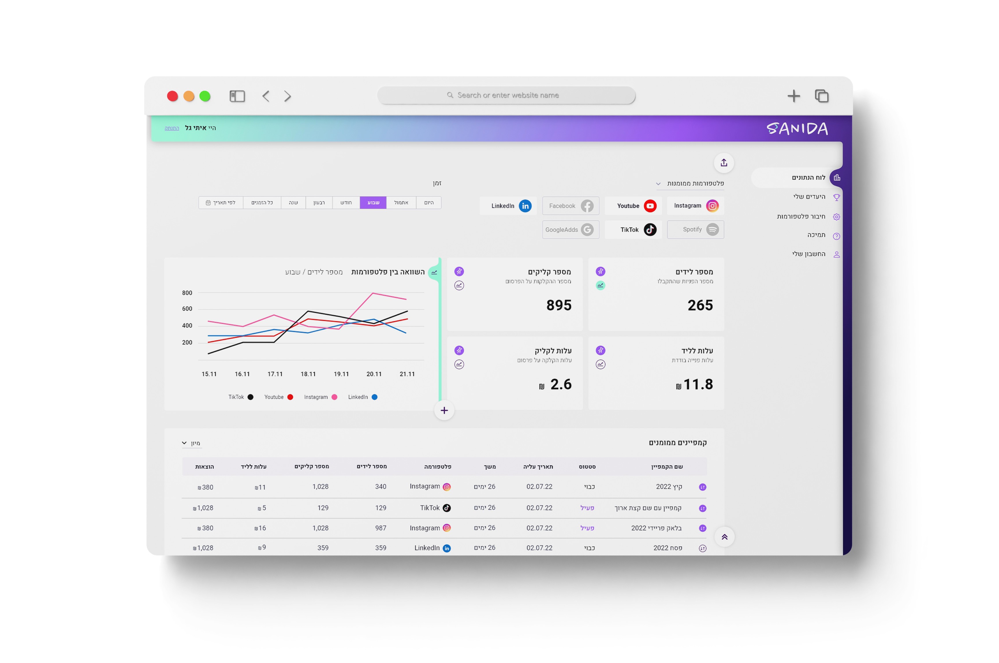
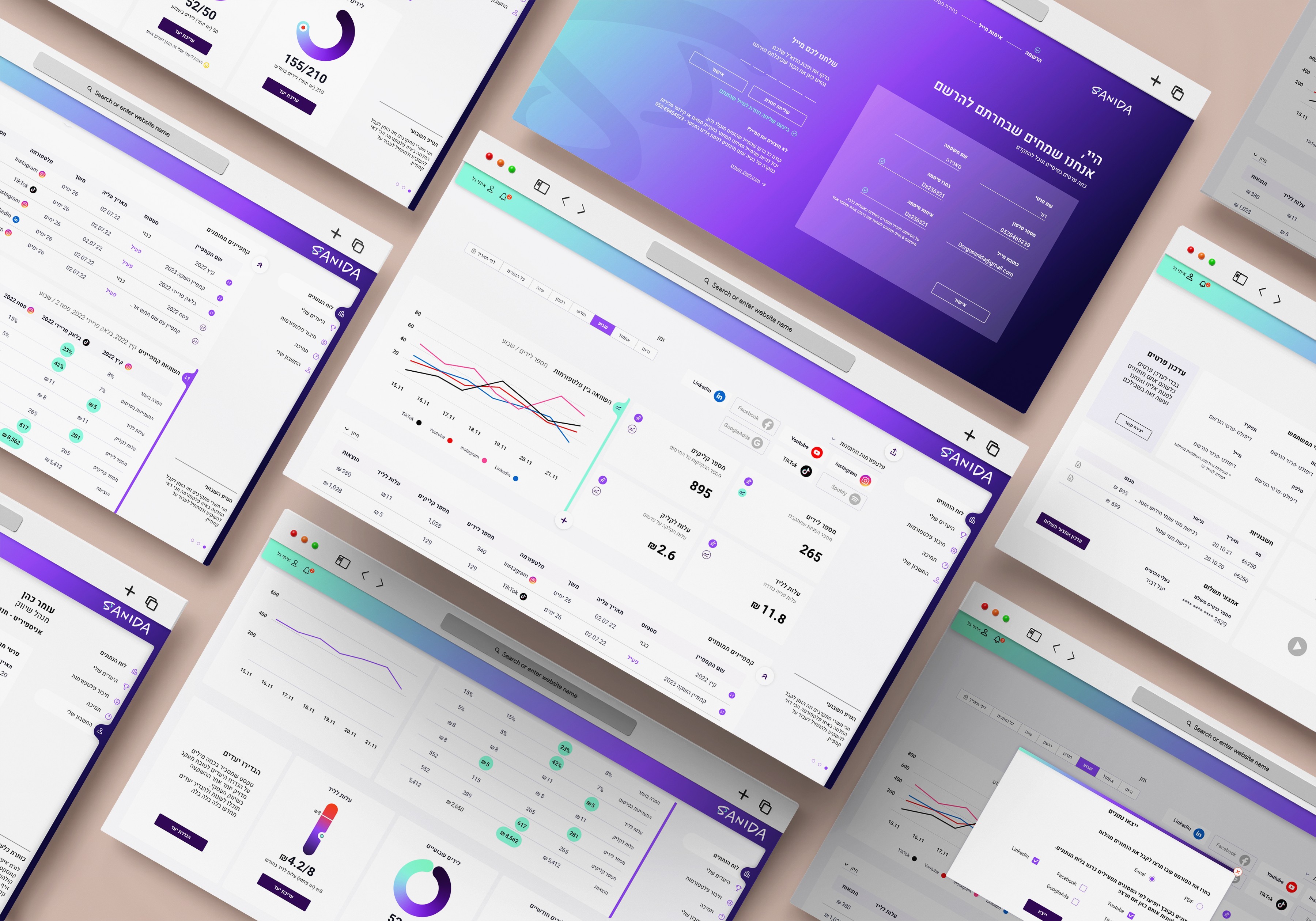
Sanida system screens showcase

crafting
the system

crafting
the system

Transforming intricate data into an easily accessible and understandable format for all users;
This project aimed to bridge the gap between complex data and user-friendly interfaces, thereby establishing a new benchmark in information accessibility.

Transforming intricate data into an easily accessible and understandable format for all users;
This project aimed to bridge the gap between complex data and user-friendly interfaces, thereby establishing a new benchmark in information accessibility.

Digital
Marketing

Experts

Visionaries

tech

savvy

technologically

challenged

Digital Marketing Experts

Visionaries

tech savvy

technologically challenged

The challenge

The system's users encompass a wide spectrum: from digital marketing experts to individuals with no experience in the field. It also includes those whose technological orientation is high as well as individuals for whom technology is not an integral part of their daily lives. Consequently, from the outset, it was essential to design the system to be exceptionally user-friendly, with a clean and intuitive interface, catering to this diverse user base.

The solution

The process had two stages - the characterization of the system and its design.

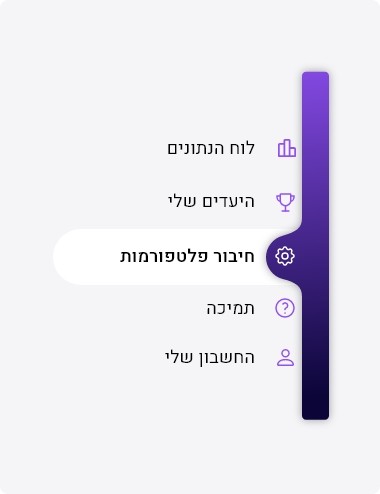
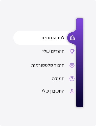
We streamlined the UX by mapping out the data required and and user actions. Through careful mapping, we identified the essential screens for the system and organized them using a familiar, straightforward navigation approach - a persistent side menu that guides users throughout their interaction with the product.

Key to enhancing user navigation was establishing a clear hierarchy, reducing visual clutter, and offering customizable elements. This approach enabled selective information display, ensuring a user-centric and efficient experience.

תהליך הפרוייקט התחלק לשניים- אפיון המערכת והעיצוב שלה.
בשלב האפיון שיתפנו פעולה כדי למפות את כלל נתוני הצפייה הנדרשים ואת הפעולות שהמשתמשים יוכלו לבצע במערכת. את אלה חילקנו למסכים השונים במערכת שהוטמעו בשיטת נביגציה מוכרת ופשוטה- תפריט צד שמלווה את המשתמש בכל זמן השימוש במוצר.
לאחר מכן צללנו לאפיון כל מסך כשהמורכב בניהם הוא מסך הדשבורד הראשי (לוח הנתונים). בכדי הקל על התמצאות המשתמשים, יצרנו היררכיה ברורה והפחתה בעומס הויזואלי על ידי התאמה אישית של תצוגת הדשבורד והסתרה של חלק הממידע שניתן לחשוף מבחירה.

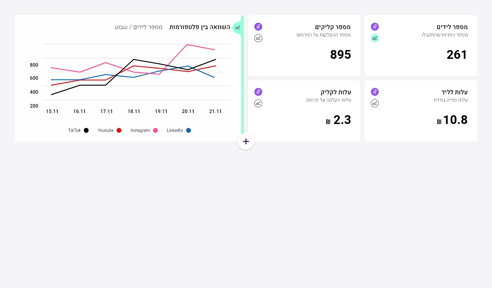
At the top of the dashboard page, there is a filter section:

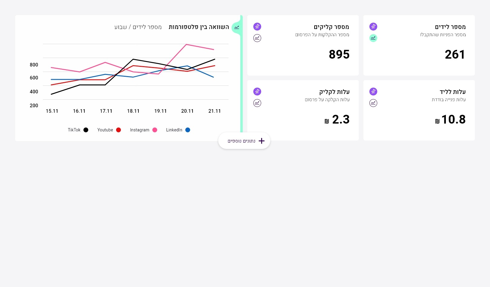
This section minimizes upon scrolling and can be expanded when needed:

The solution

The process had two stages - the characterization of the system and its design.

In the UX phase, we collaborated to understand all the viewing data required and the actions that the users will be able to perform using the system. By mapping those, we discovered what screens would be in the system and ordered them in a familiar and simple navigation method - a side menu that accompanies the user the entire time the product is being used.

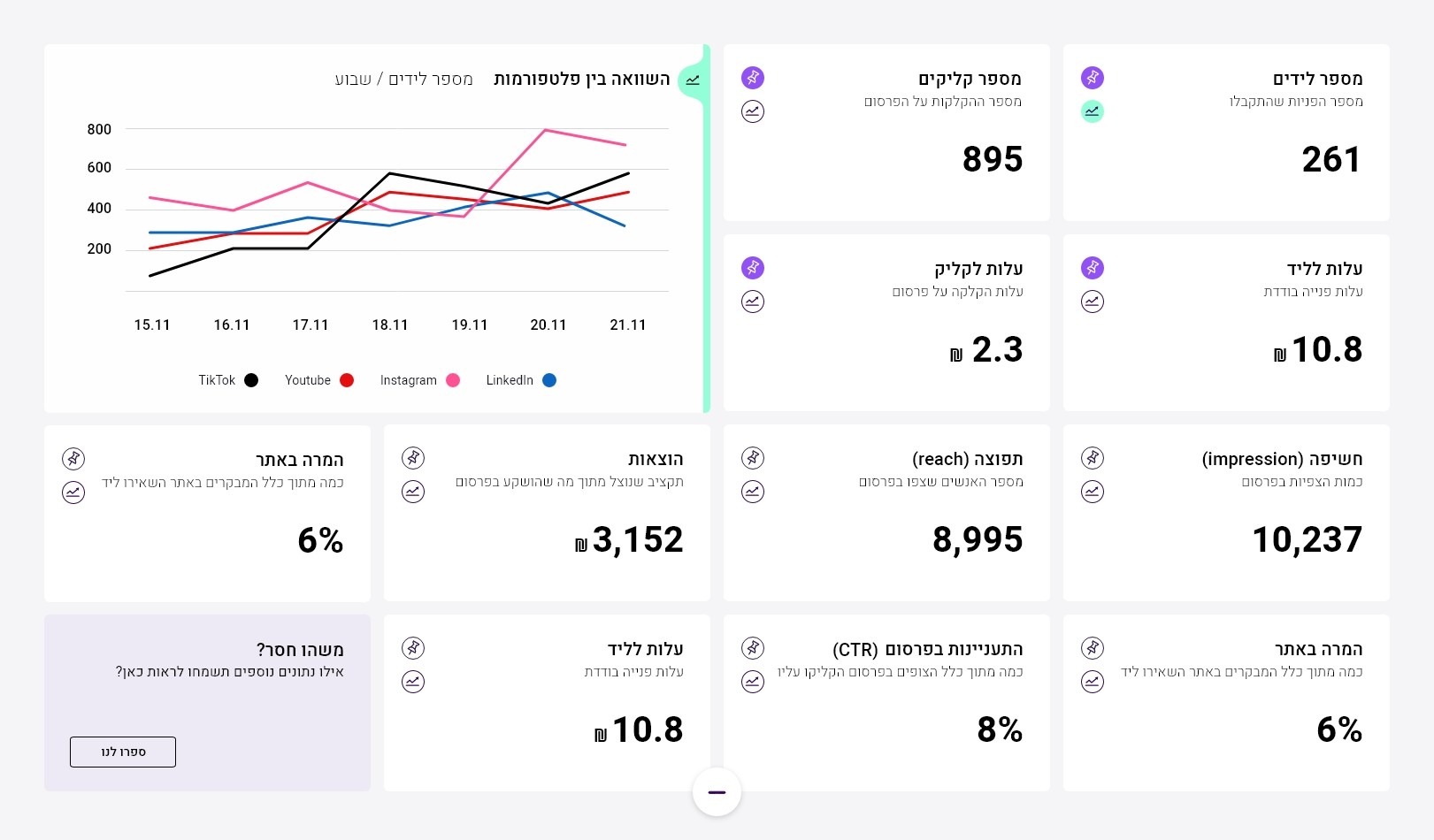
After that, we dived into characterizing each screen, the most complex of which is the main dashboard screen.

At the top of the dashboard page, there is a filter section:

This section minimizes upon scrolling and can be expanded when needed:

In order to make it easier for users to navigate, we created a clear hierarchy and reduced the visual load by allowing to personally customize elements display on the panel, as well hiding a part of the information that can be revealed by choice.

mini GUI - Sanida system

The second step was dressing up the system.
Responding to Sanida's entrepreneurs, we aimed for an approachable, fresh, and youthful ambiance, ensuring the system communicates with users in a relatable manner.
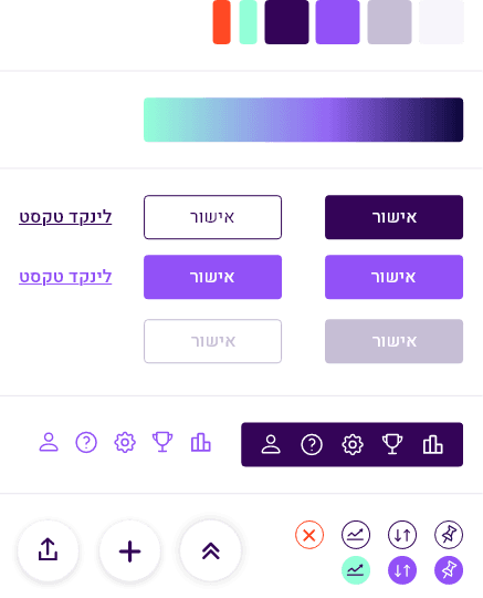
We selected a versatile color palette, appealing to both women and men, carefully choosing hues that aid in establishing a clear hierarchy and highlighting motivational elements throughout the system.

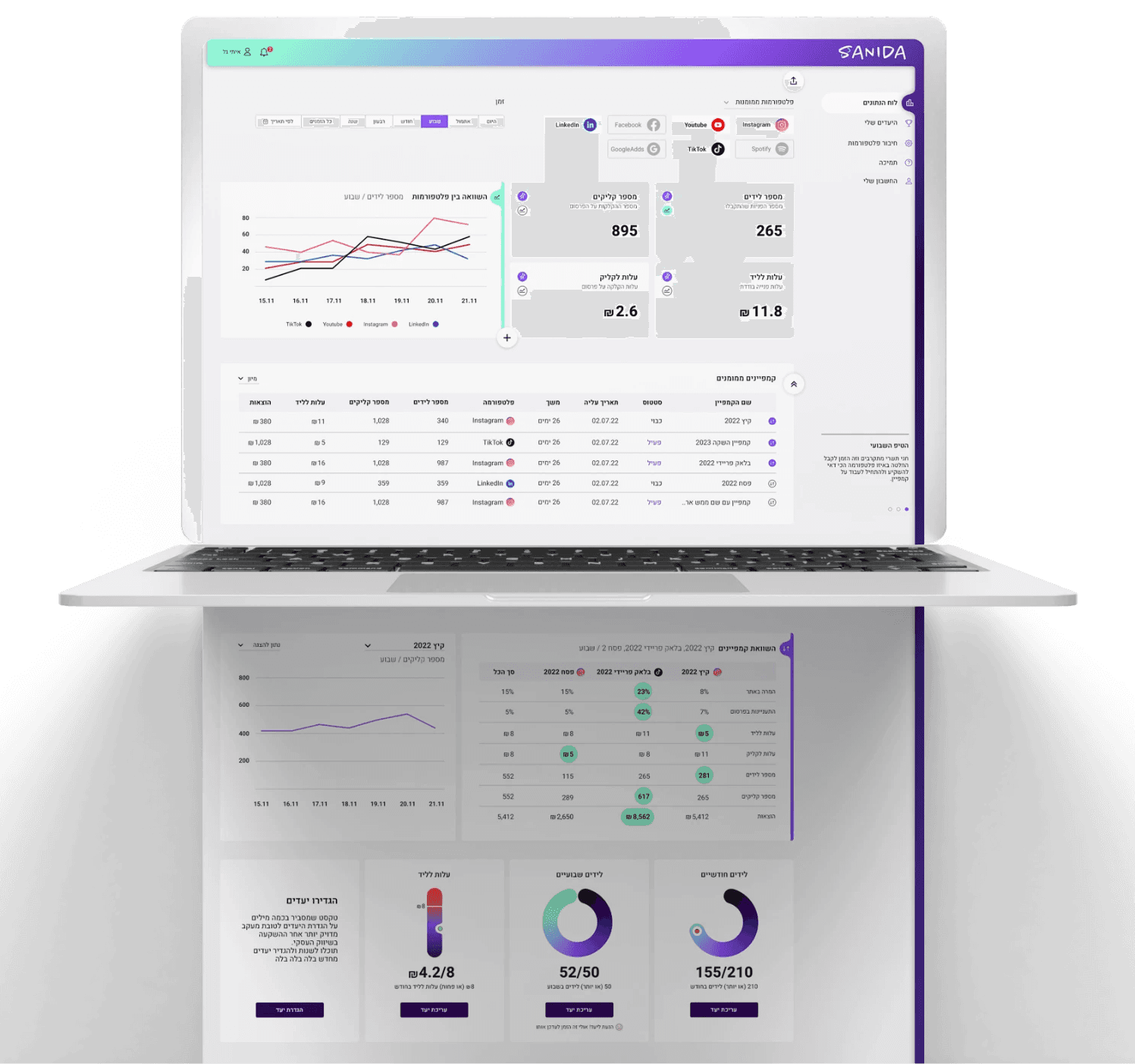
Sanida dashboard full scroll showcase
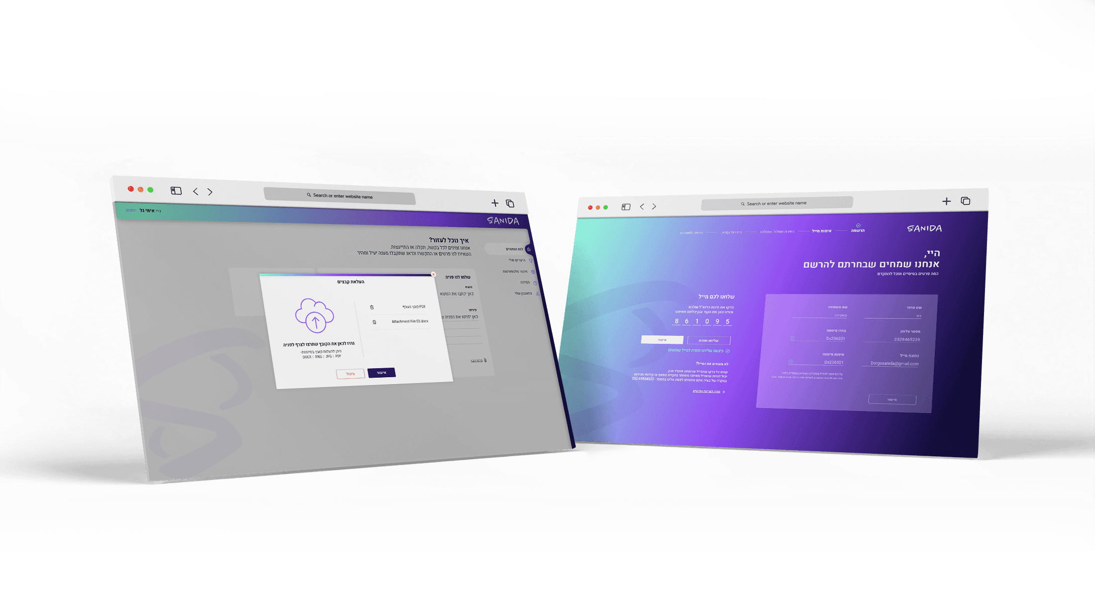
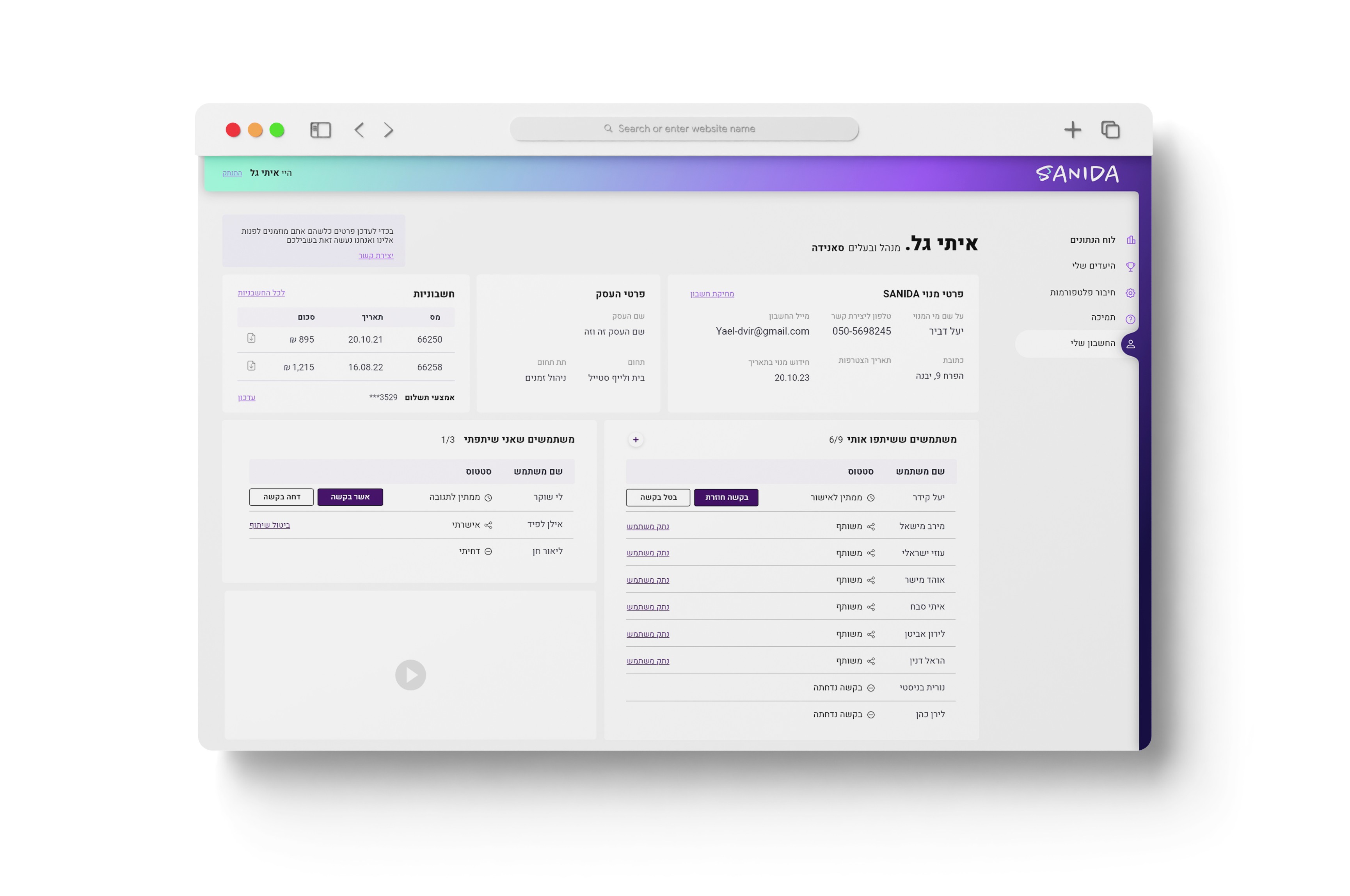
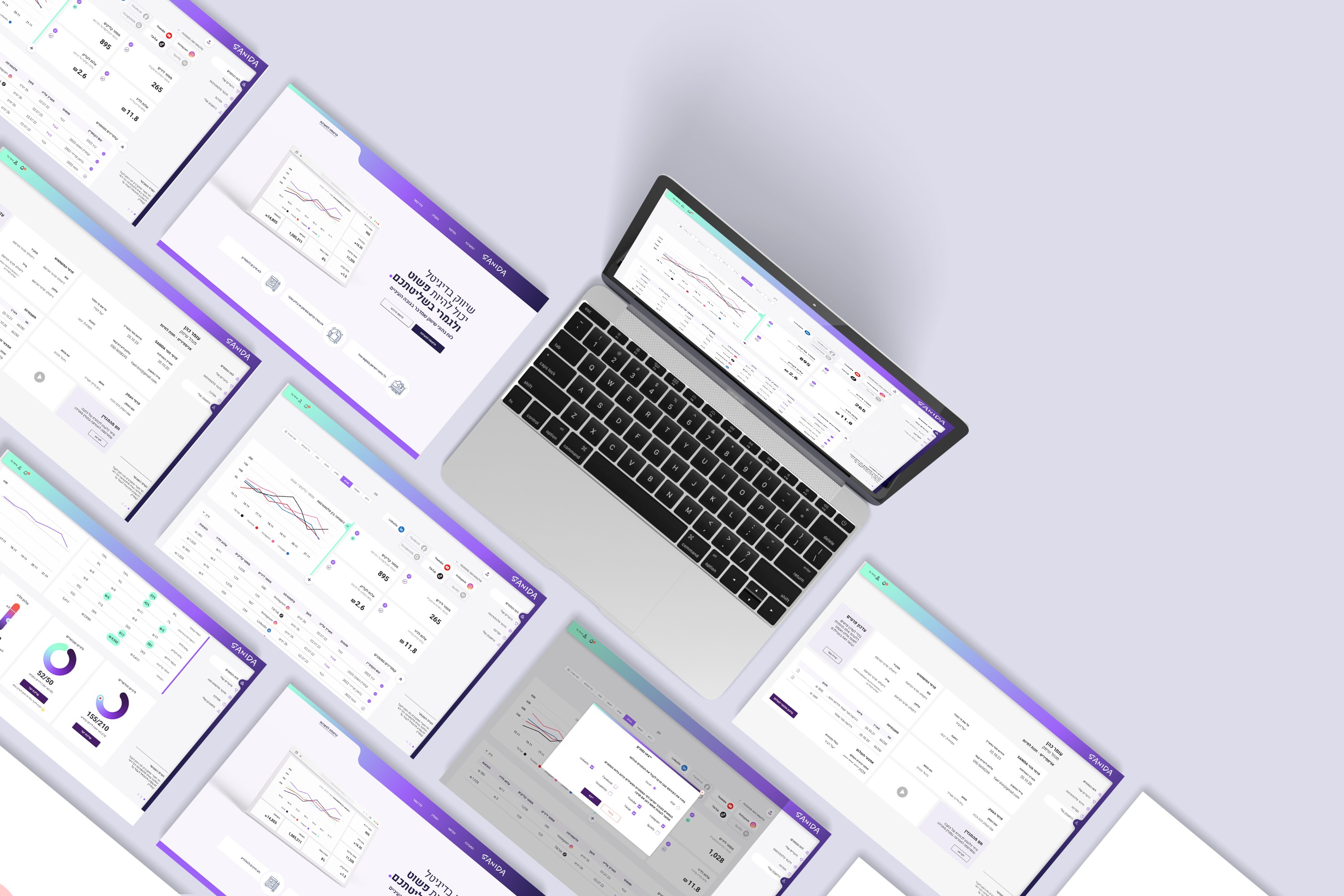
Sanida screens showcase

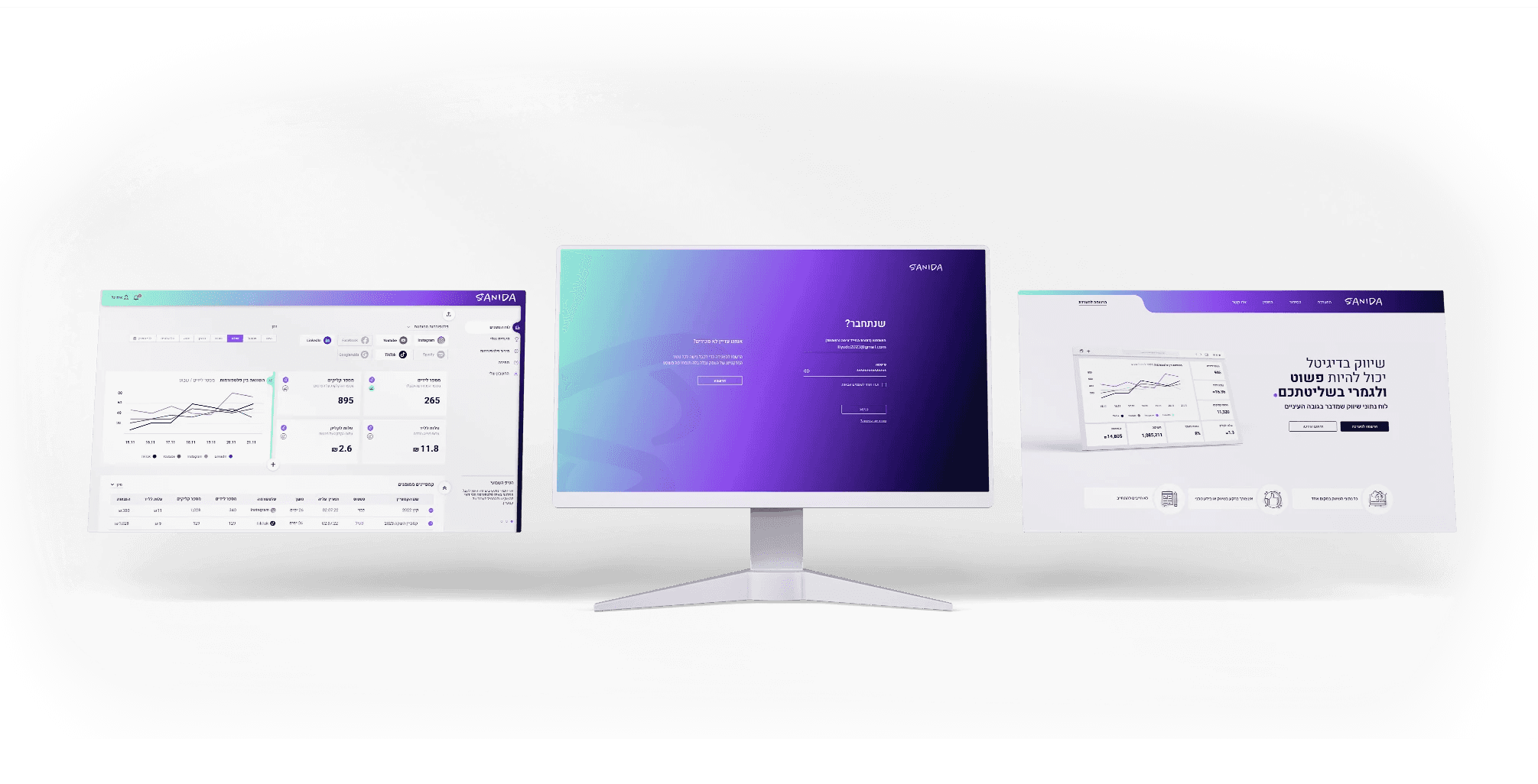
From the sign-up process through contact to the user profile and main dashboard, every screen and element was crafted using our designed system, ensuring a cohesive and seamless user experience

consistent
experiense

consistent
experiense

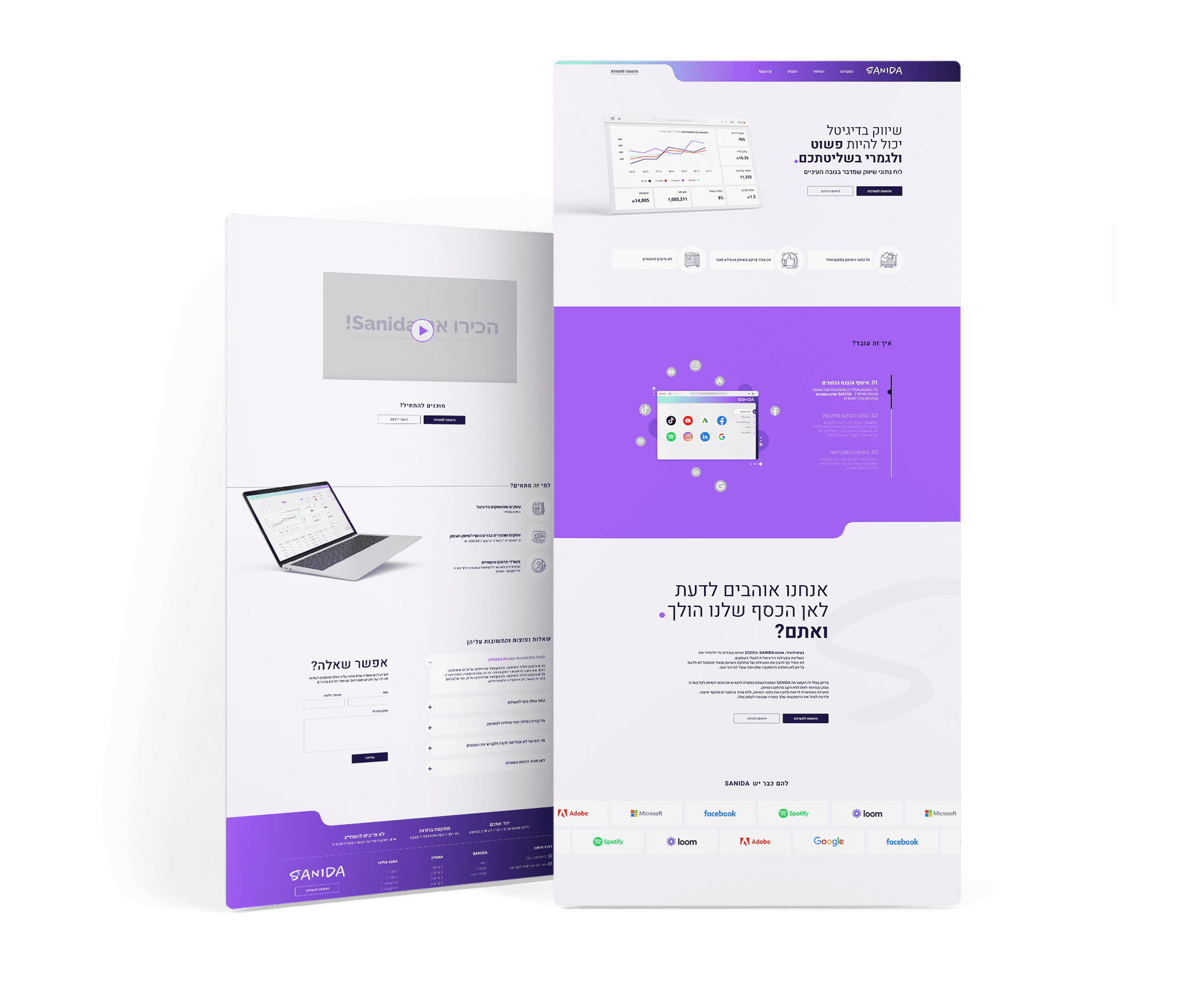
Designing the marketing website using our new design system and brand,
we created a unified and cohesive user experience that seamlessly guides users through each interaction with ease and familiarity.

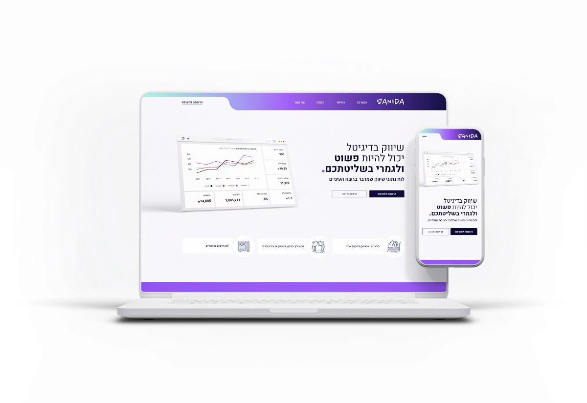
sanida website hero section showcase

Sanida's website

The marketing website captures the brand's approachable and fun essence, ensuring that visitors appreciate the service value.
Its goal is to introduce Sanida, boost credibility, and encourage service subscriptions through a brand-oriented engaging design.
Bringing content to life

To elevate the website's appeal and interactivity, we carefully crafted custom animations and playful icons, making the user experience more engaging and dynamic.

Bringing content to life

Bringing content to life

Bringing content to life

To elevate the website's appeal and interactivity, we carefully crafted custom animations and playful icons, making the user experience more engaging and dynamic.

To elevate the website's appeal and interactivity, we carefully crafted custom animations and playful icons, making the user experience more engaging and dynamic.

To elevate the website's appeal and interactivity, we carefully crafted custom animations and playful icons, making the user experience more engaging and dynamic.

כדי ליצור אינטראקטיביות ועניין באתר, יצרנו אנימציות מותאמות ושילבנו אייקונים בשפת המותג, מה שהופך את חווית המשתמש למושכת ודינאמית הרבה יותר.

sanida website full scroll showcase
sanida sign up, website and system showcase

Sanida project is a user-friendly system & an inviting website, showcasing our dedication to making complex data accessible and engaging.

Sanida full showcase